Zimoma
An iOS notes app built around one bar: type, talk or snap, and the note is saved before you have decided where it goes.
- Role
- Product design, UI, design system
- Type
- Personal project · Product design
- Status
- Designed in Figma, built in Expo. Not released
- Year
- 2026
Why I made this
A thought lasts about as long as it takes to pick a folder.
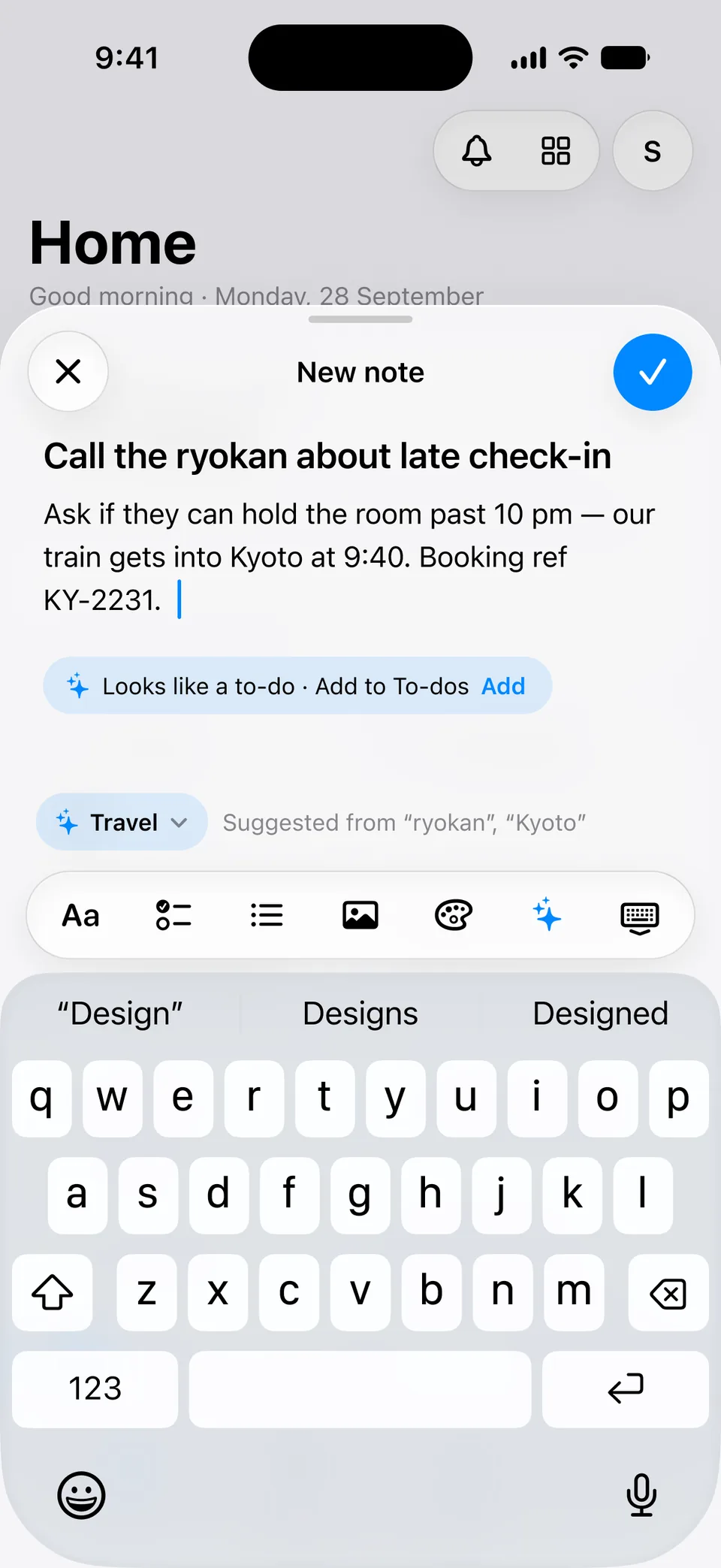
The brief I wrote for myself was one line: open the app and be writing within three seconds.
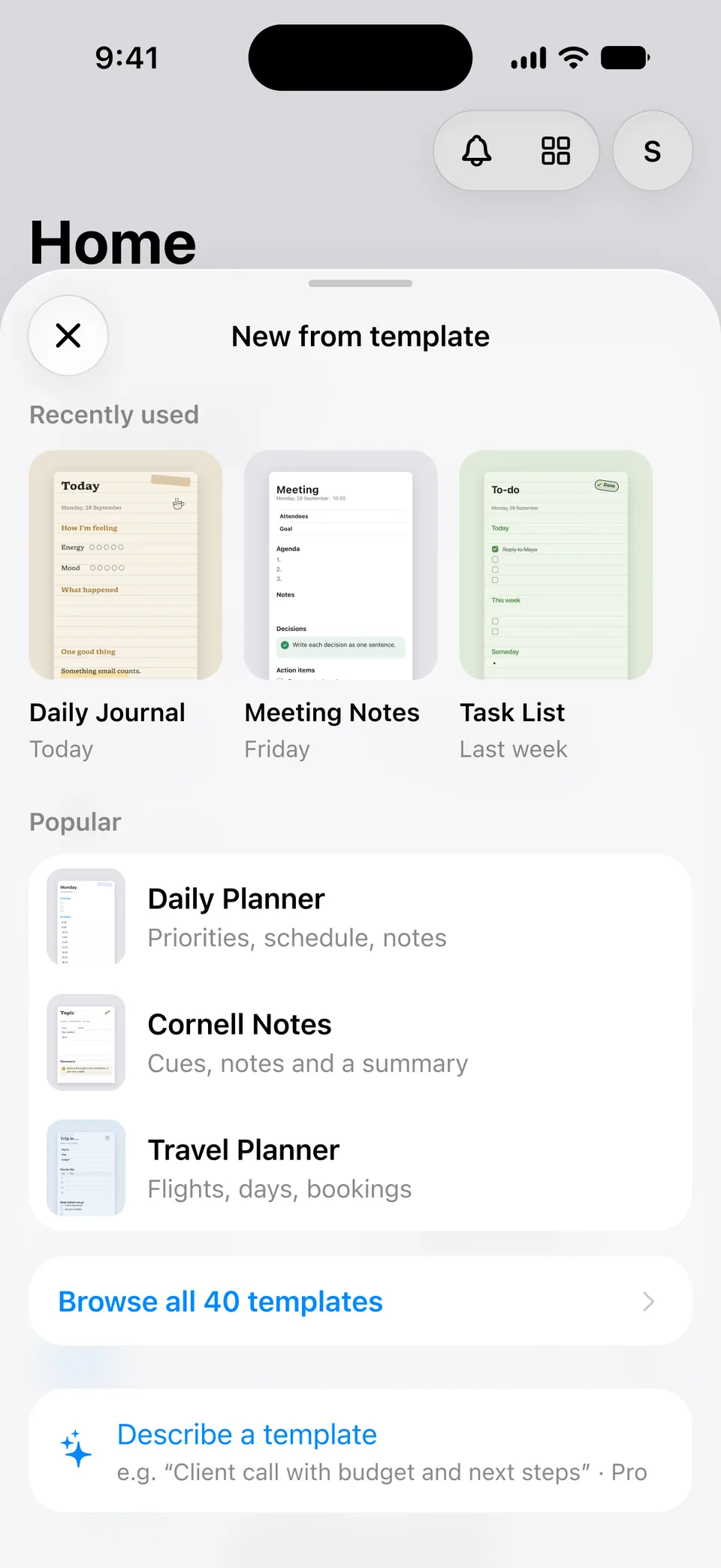
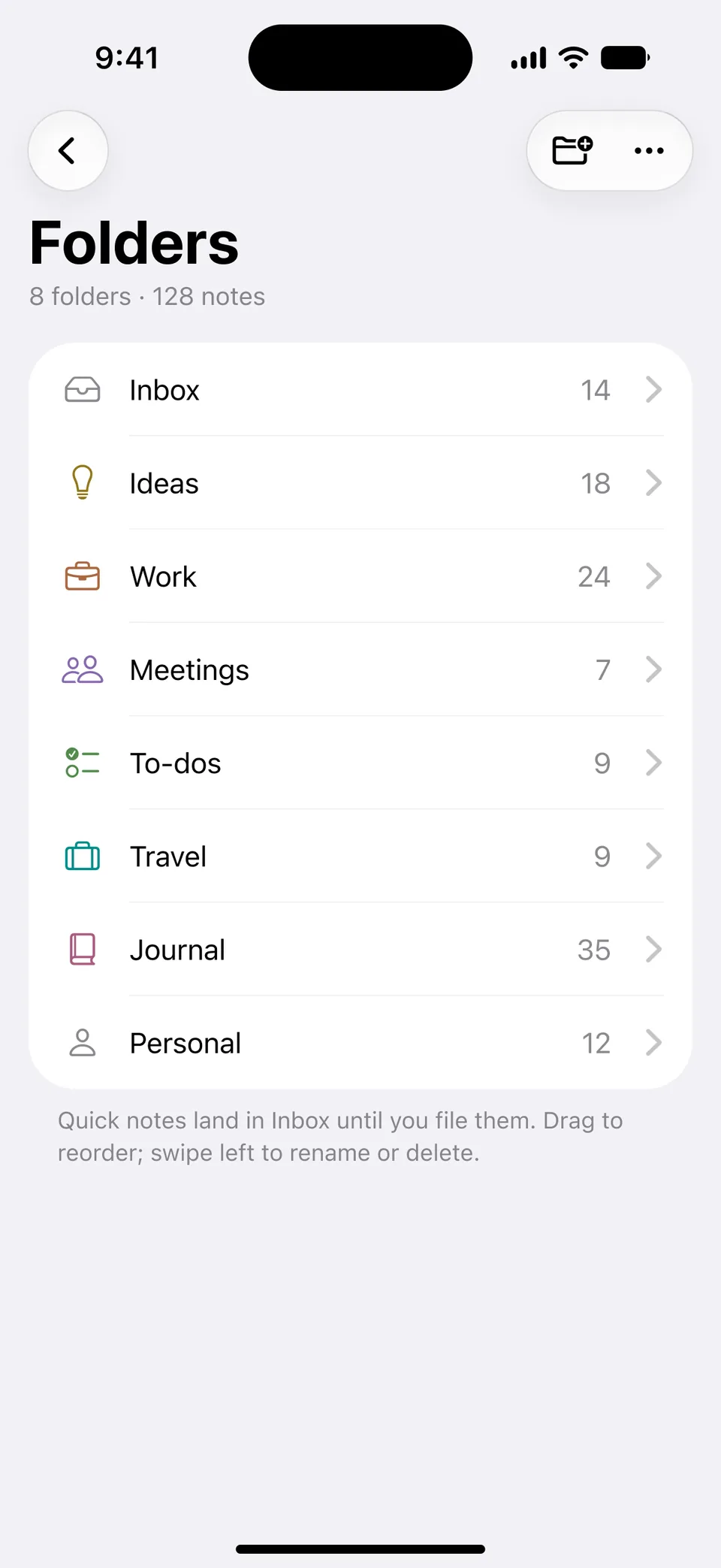
Everything that normally comes first — a title, a folder, a kind of note — I moved to afterwards. A note lands in an Inbox, and the app suggests where it might belong.
I also wanted it to feel like it belongs on an iPhone, not like a concept shot.
The problem
Most notes apps ask what you are making before they let you make it.
Personal observations and design hypotheses. No user research was run for this project.
Capture is too deliberate
New note, choose a type, name it. Three decisions before the first word.
Filing happens too early
You are asked where it goes while you are still working out what it is.
Every input is treated the same
Typing, talking and photographing a page are different moments. They usually share one empty screen.
The approach
No code until the Figma was right. Getting there took more rejected directions than kept ones.
- 01
Grey rows
The first pass was a canvas and a list. It was Apple Notes again, so it went.
- 02
Three identities
A serif one, a mono one, a colourful one. Together they were overwhelming, and none of them was the app.
- 03
The magazine
An editorial serif Home looked good and read like a reading app. Archived.
- 04
Native
SF Pro only, system materials — and the character moved out of the styling and into how capture behaves.
- 05
Home as widgets
Home became widgets you choose. The first version was too much; the one that stayed is monochrome, fits one screen and has no gradients.
- 06
Then code
Built screen by screen from the design file: 185 of 187 frames so far.
Design decisions
- 01
One bar, three ways in
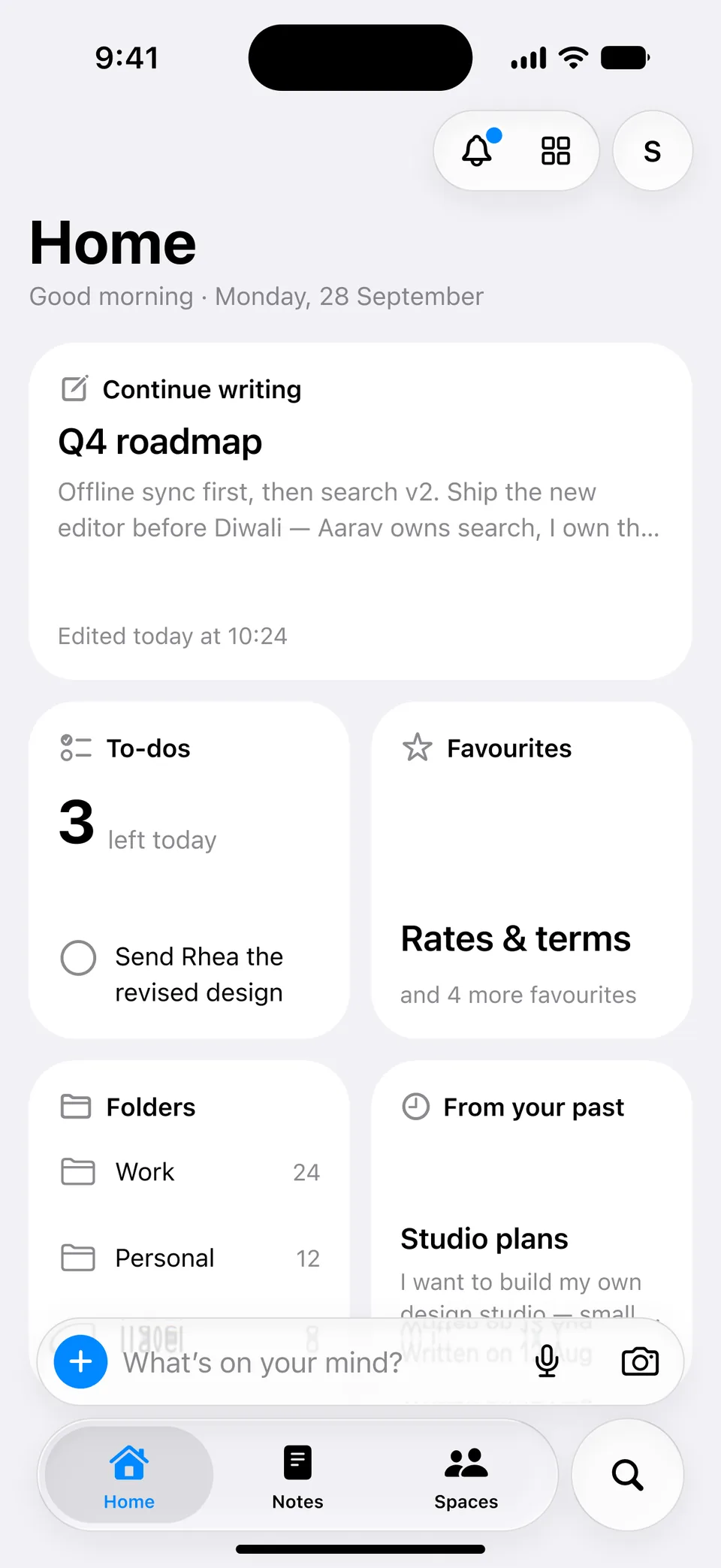
“What’s on your mind?” sits above the tab bar with a plus, a mic and a camera. Type, talk or snap from the same place.
- Why
- The first interaction should feel closer to opening a thought than to creating a document.
Home, with the capture bar above the tab bar - 02
The bar becomes the recorder
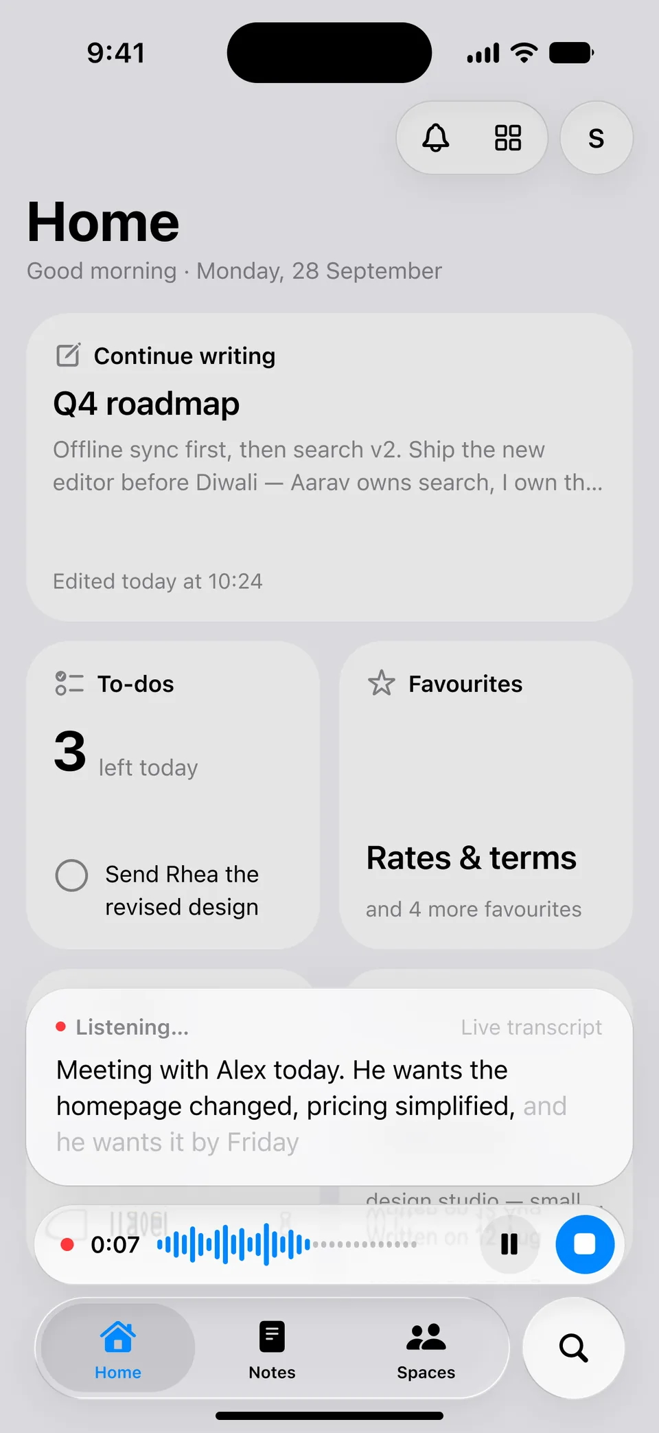
Start talking and the bar itself turns into the recording controls, with a live transcript above it. When you stop, the same bar says where the note was saved, with Undo.
- Why
- A toast floating over the screen cut through the widgets behind it. Keeping it in the bar puts the confirmation where your thumb already is.
Voice: a live transcript above the bar - 03
File it later
A typed note goes to Inbox. The app suggests a folder and shows why, and offers to turn a line into a to-do.
- Why
- Suggesting is cheaper than asking. You can ignore a suggestion; you cannot ignore a required field.
- Effect
- The suggestions are worked out on the phone. Nothing is sent anywhere.
A suggested to-do and a suggested folder - 04
Glass floats, solid scrolls
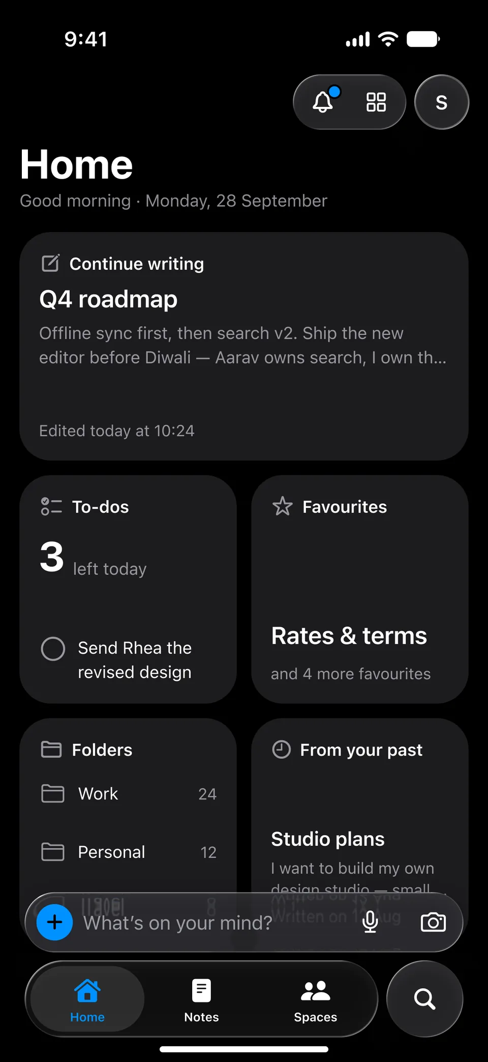
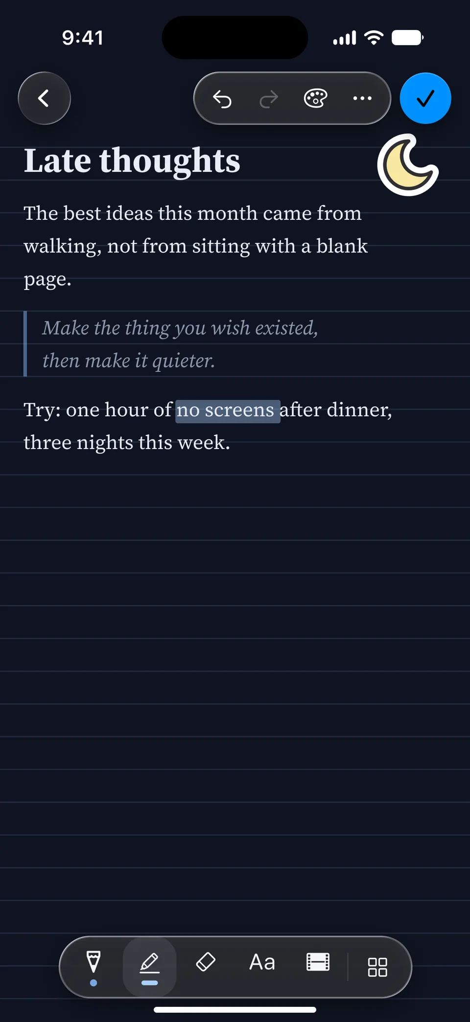
If it scrolls with the content, it is a solid surface. If it floats above the content, it can be glass.
- Why
- Glass everywhere kills contrast and reads as a concept shot.
Dark: solid widgets, glass bars - 05
Blue means action
In the interface, blue is only for things that do something, and only the one primary action is filled.
- Why
- If the accent also decorates, it stops telling you where to press.
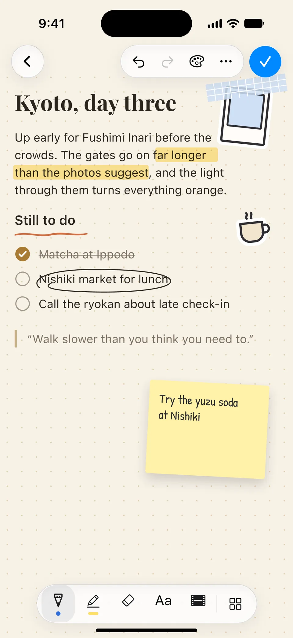
One filled blue control: the tick - 06
A desk, but only when asked
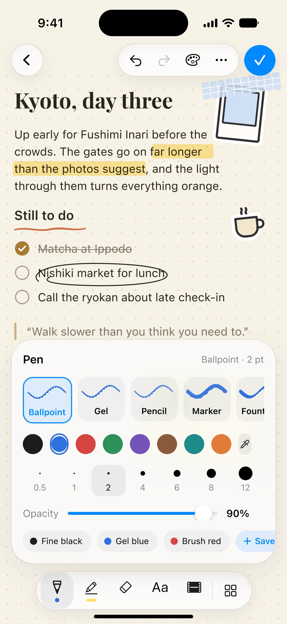
Pens, highlighters, washi tape, stickers and papers live in a separate Customize mode, per note. The default editor is plain.
- Why
- Decoration is a choice someone makes about one note, not a toolbar everyone carries around.
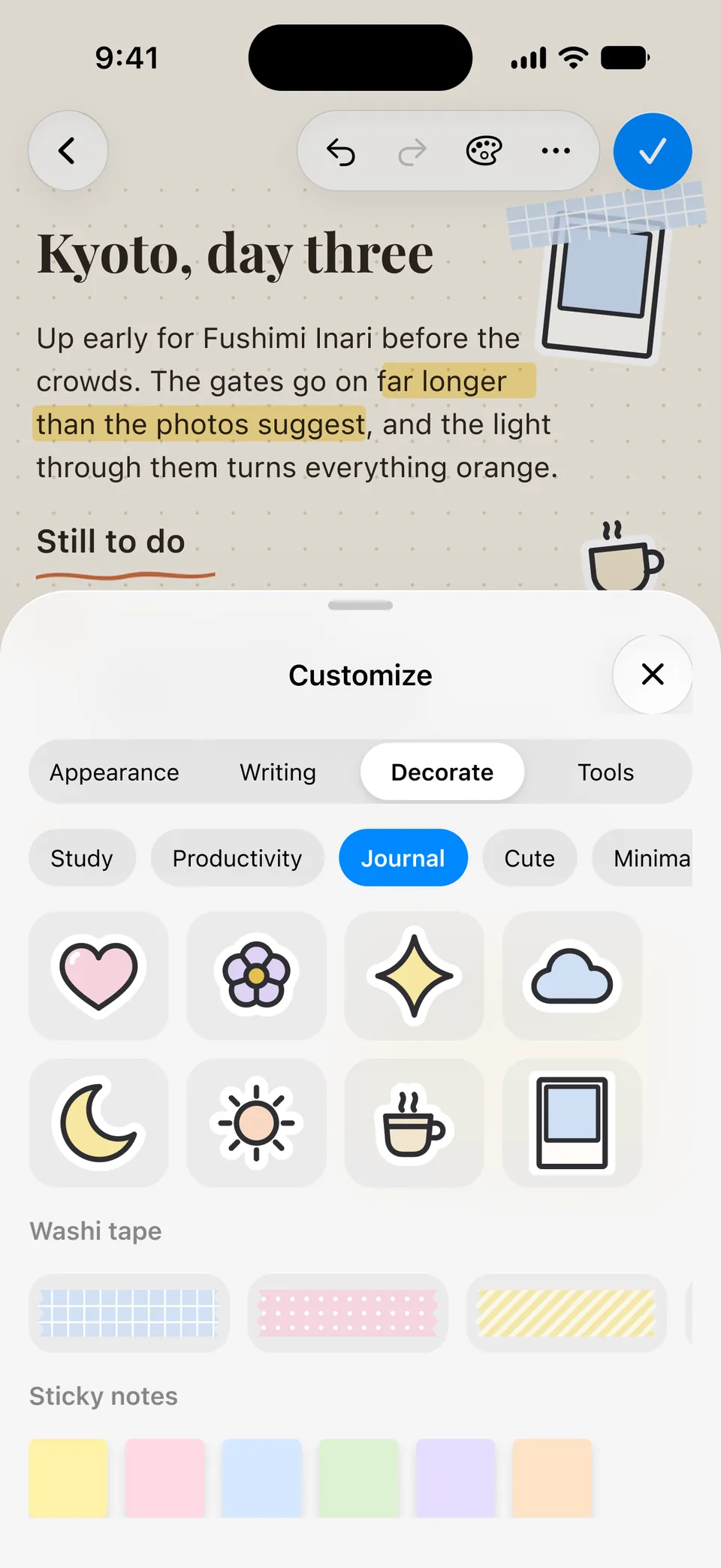
Customize: stickers, washi tape, sticky notes
Building the interface system
One set of variables, four modes, and a rule for every surface.
- Action#0088FF
- Canvas#F2F2F7
- Surface#FFFFFF
- Sand#F7F1E6
- Butter#FBF5D8
- Indigo#6155F5
Typeface
SF Pro
SF Pro for the interface, on a 16/22 body. A note can be set in Source Serif 4, SF Pro Rounded or JetBrains Mono instead.
- accent/solid
- #0088FF
- bg/canvas
- #F2F2F7
- radius/card
- 26
- radius/sheet
- 38
- space/margin
- 16
- tap/minimum
- 44
Concentric corners
26 for cards, 38 for sheets, 10 for what is nested inside. A corner agrees with the corner it sits in.
Four modes
Light, Dark, and an increased-contrast version of each — from the same variables.
Eight papers
Sand, Butter, Sage, Mist, Lilac, Rose, Graphite, White. A note can have its own.
Springs without bounce
Critically damped, at 200, 350 and 500 ms. With Reduce Motion on, they cross-fade.
Light and dark are one set of variables. Drag across.
Interaction
The bar at the bottom of this page is the same idea. Tap it.
- 01
Type
A sheet rises with the keyboard. The first line becomes the title; Done stays off until there is something to save.
- 02
Keep going
Drag the grabber up and the quick note continues in the full editor. Same note, more room.
- 03
Talk
Timer, waveform, pause, stop. When you finish, the transcript is tidied into a note.
- 04
Snap
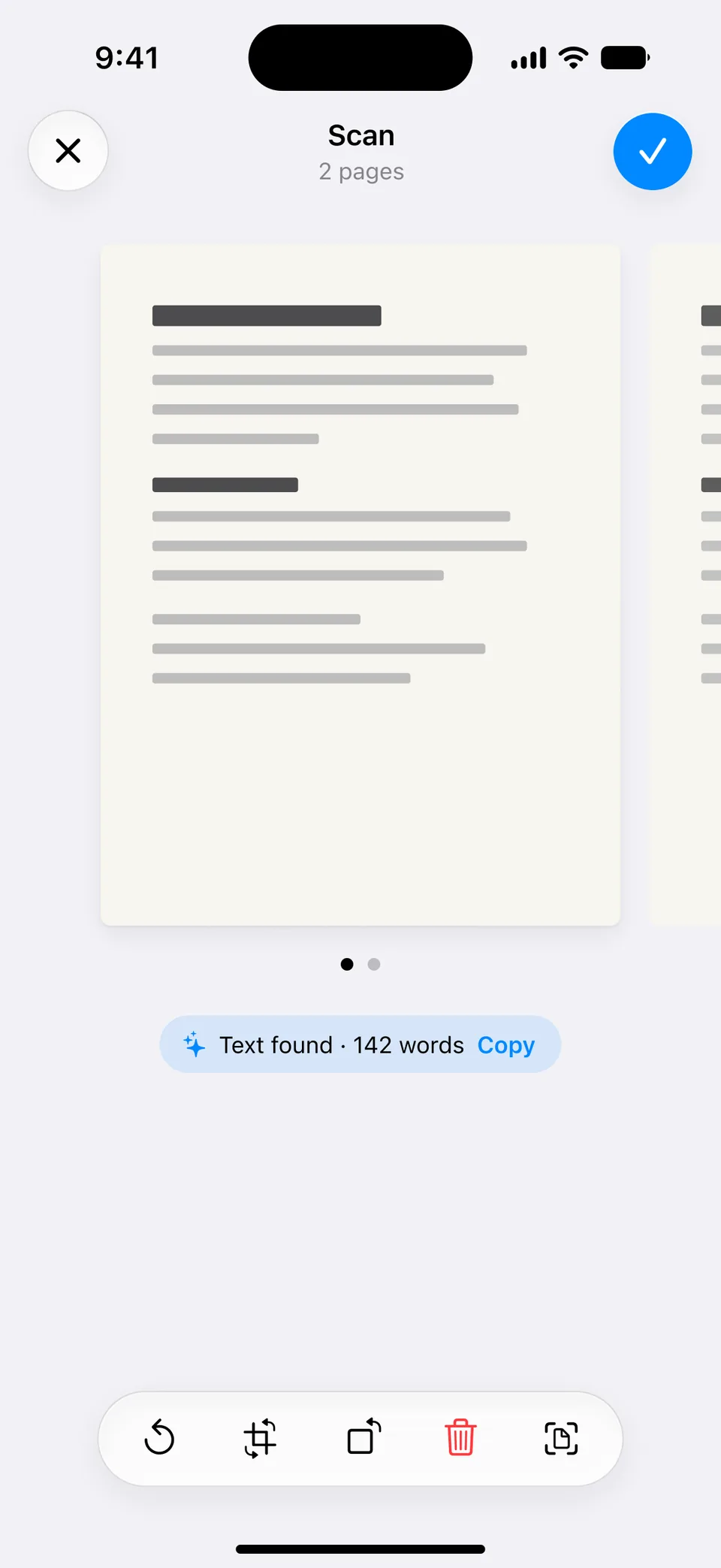
A dark camera, then a review that tells you how much text it found.
The build
Built with
- Expo SDK 57the app, on React Native 0.86
- expo-routernavigation
- Reanimatedsprings and gestures
- perfect-freehandink
- expo-glass-effectthe glass
- Hono + Postgressync server
The bars and sheets are native glass. The page you write on is a web surface inside them.
Local first
Edits are written on the phone and queued in an outbox. If two devices disagree, both copies are kept. Nothing is silently merged.
One surface to write on
The note is a DOM component, so text, ink and stickers share one canvas. Everything around it is native.
One catalogue
Papers, pens and stickers are defined once, and feed both the app and the previews in the design file.
The model stays on the server
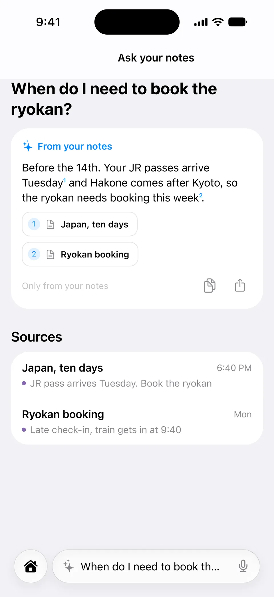
“Ask your notes” calls a model from the server only. The capture suggestions do not use one at all.
The result
Designed end to end, and built to match: 185 of 187 frames.
It runs in the simulator and on the web. It has not been released, so there are no users and no numbers to show — only the product.
What I learned
Every direction I invented from scratch missed.
Serif, mono, magazine: each looked like a portfolio piece and none looked like something you would open ten times a day. What worked was staying inside the platform and spending the originality on behaviour — one bar, three ways in.
I also stopped arguing about taste in the abstract. Two or three real options side by side settle it faster than a paragraph does.