Unikist
A hand-curated index of design resources where the home page is a search field, not a headline.
- Role
- Design, front-end
- Type
- Personal project · Web product
- Status
- Live · unikist.com
- Year
- 2026
The problem
Resource sites are built for browsing. Nobody arrives wanting to browse.
A design hypothesis, not a research finding.
You arrive with a noun — an icon set, a font, a mockup — and you want the two or three good ones.
Retrieval, not discovery
The page should answer a word, not present a feed.
Curation has to show
One line on what it is, a price badge, and a short “why we like it”. Short enough to trust.
Extras stay behind the index
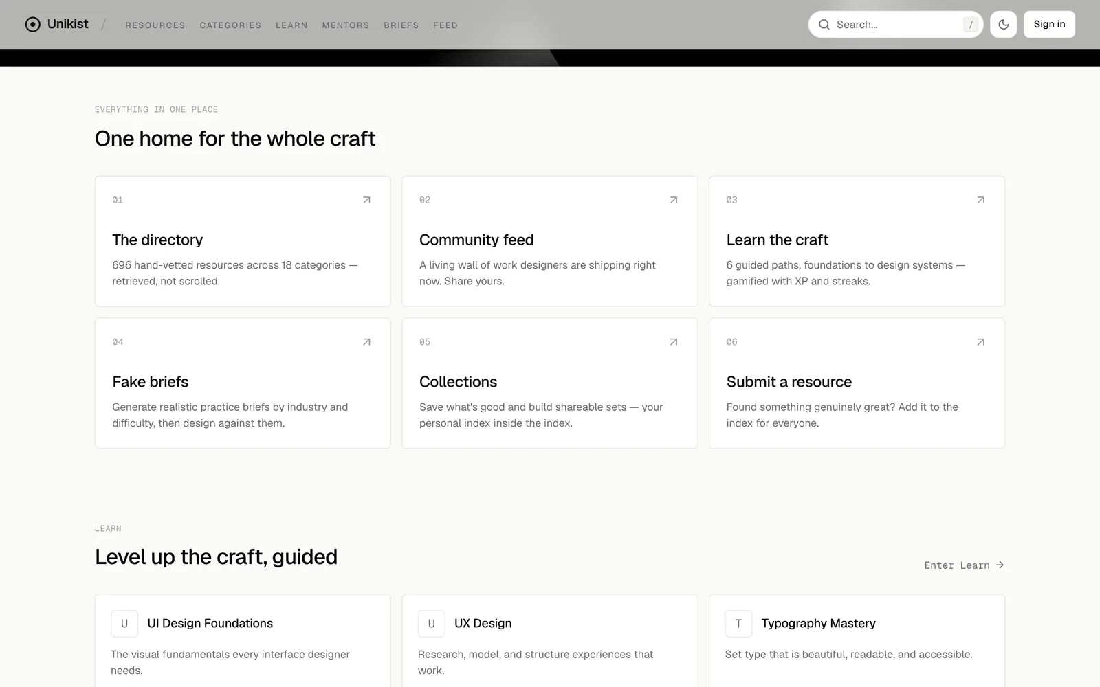
Learning paths, briefs, collections and a feed are there. None of them is the front door.
The shelves
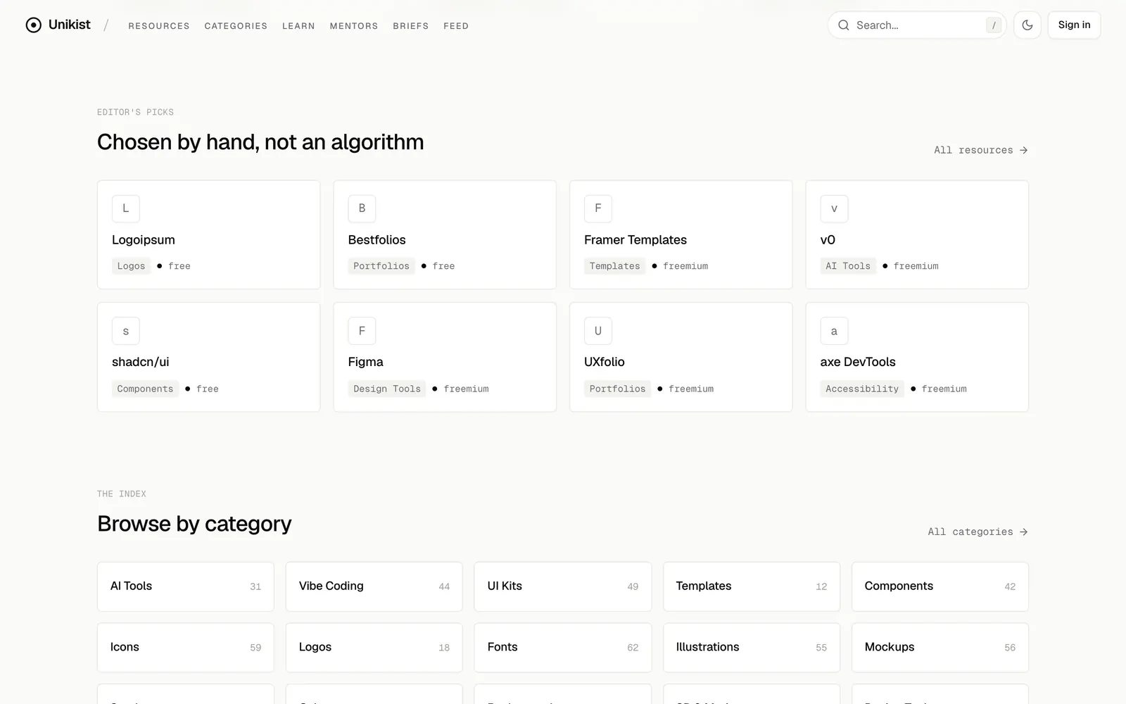
Eighteen categories, filed by hand. Keep scrolling and they file themselves.
- AI Tools
- Vibe Coding
- UI Kits
- Templates
- Components
- Icons
- Logos
- Fonts
- Illustrations
- Mockups
- Stock
- Color
- Backgrounds
- 3D & Motion
- Design Tools
- Accessibility
- UI Inspiration
- Portfolios
Eighteen categories, checked by hand. Keep scrolling and they file themselves.
- 01
Counts on every shelf
Fonts 62, Icons 59, Mockups 56 — down to Templates and Portfolios at 12. A number tells you whether a shelf is worth opening.
- 02
Filters live in the address
Category, price, licence and sort are written into the URL, so a filtered view is something you can send.
- 03
Search this page
The line at the top of this page is the same idea. It searches this portfolio.
The approach
It was redesigned three times in nine days before it found its tone.
Resources only
A light editorial system, a database and a command palette. Just the directory.
Community
Votes, accounts, profiles, a feed — and a warmer look to go with them.
More shelves
Collections, four new categories, learning paths, practice briefs, and a home page shaped like a gallery.
The instrument
The home page went monochrome and the gallery was replaced by a single input. That is the build that is live.
Search and structure
- 01
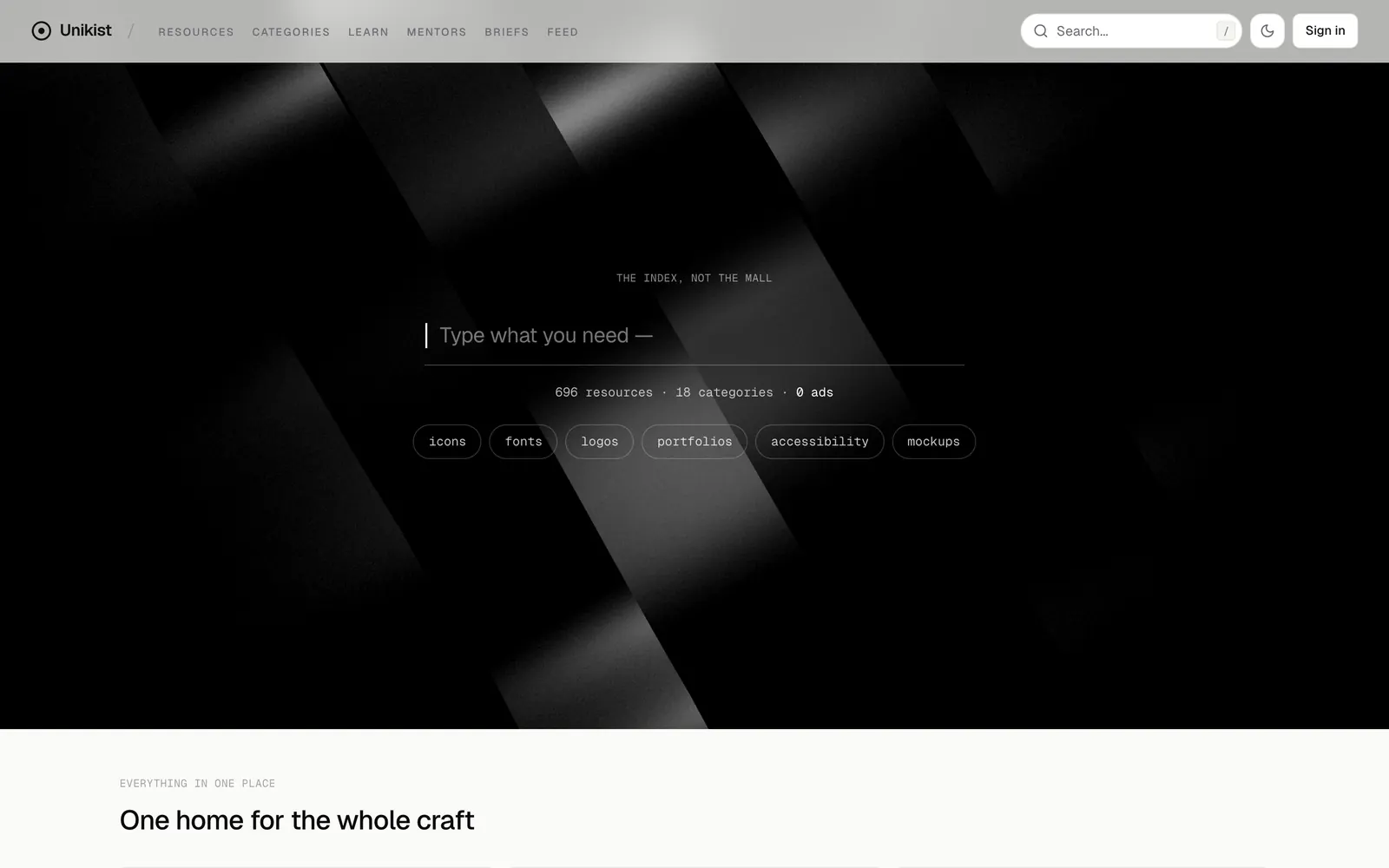
The hero is an input
No headline. A caret, “Type what you need —”, and six chips that fill it in for you.
- Why
- If search is the product, it should be the first thing you can touch.
- 02
Results resolve in place
The best twelve matches arrive under the field with the matched letters marked. Enter opens the first; Esc clears.
- Why
- A results page is a second decision. Most searches here are one word.
- 03
Plain scoring, no AI
A name that starts with your word beats one that contains it, which beats a tag, which beats the description.
- Why
- For a few hundred hand-filed entries, a ranking you can predict is better than a clever one you cannot.
- Effect
- It runs in the browser on every keystroke. There is nothing to wait for.
- 04
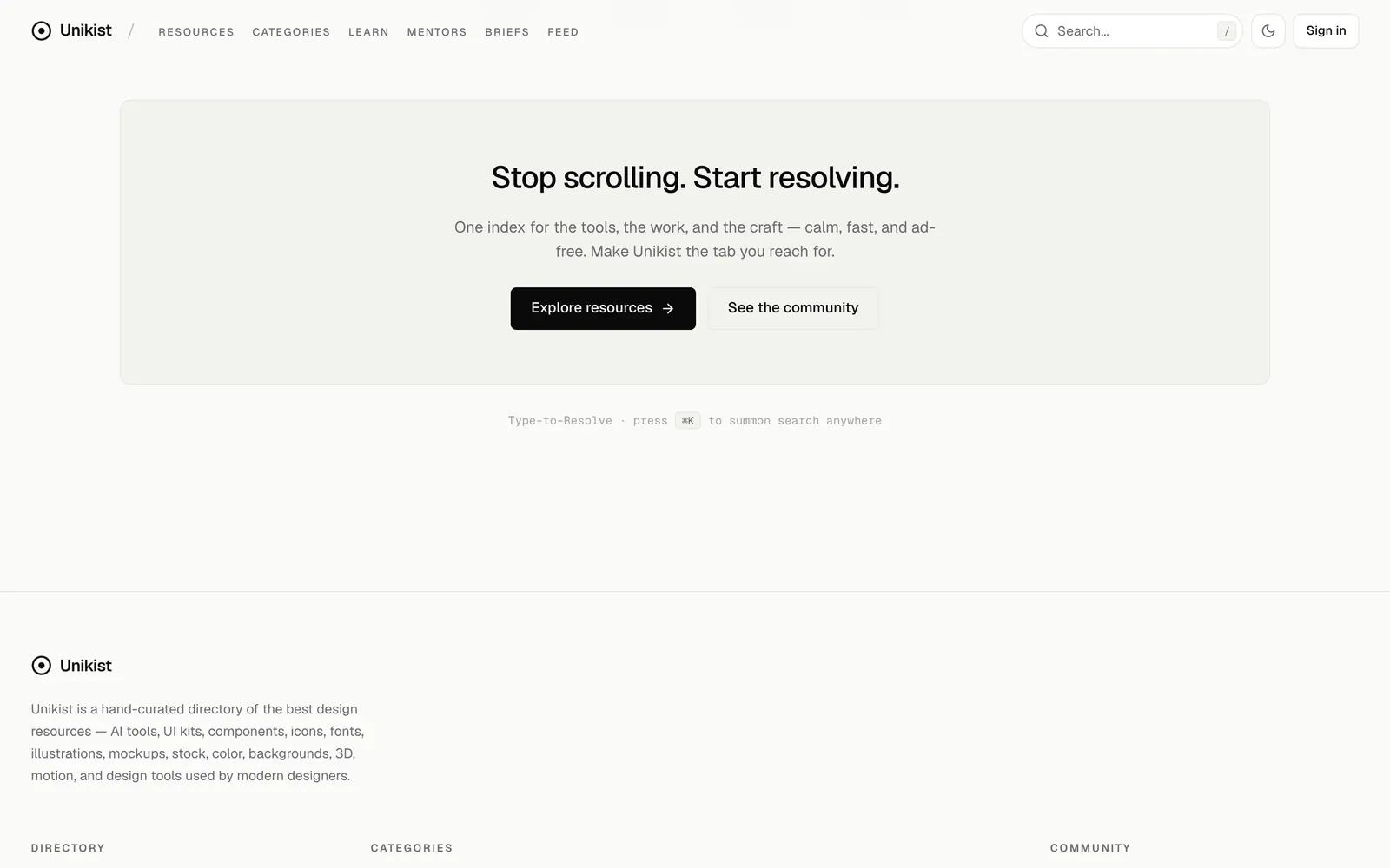
Three doors, one search
The hero, “/” for the field in the header, and ⌘K from anywhere. All three use the same scoring.
- Why
- Wherever your hands are, the same thing should happen.
- 05
Chosen by hand, and it says so
Editor’s picks show a letter in a tile, the category and the price. No logos competing for attention.
- Why
- A short list that someone chose is the whole reason to use an index instead of a search engine.
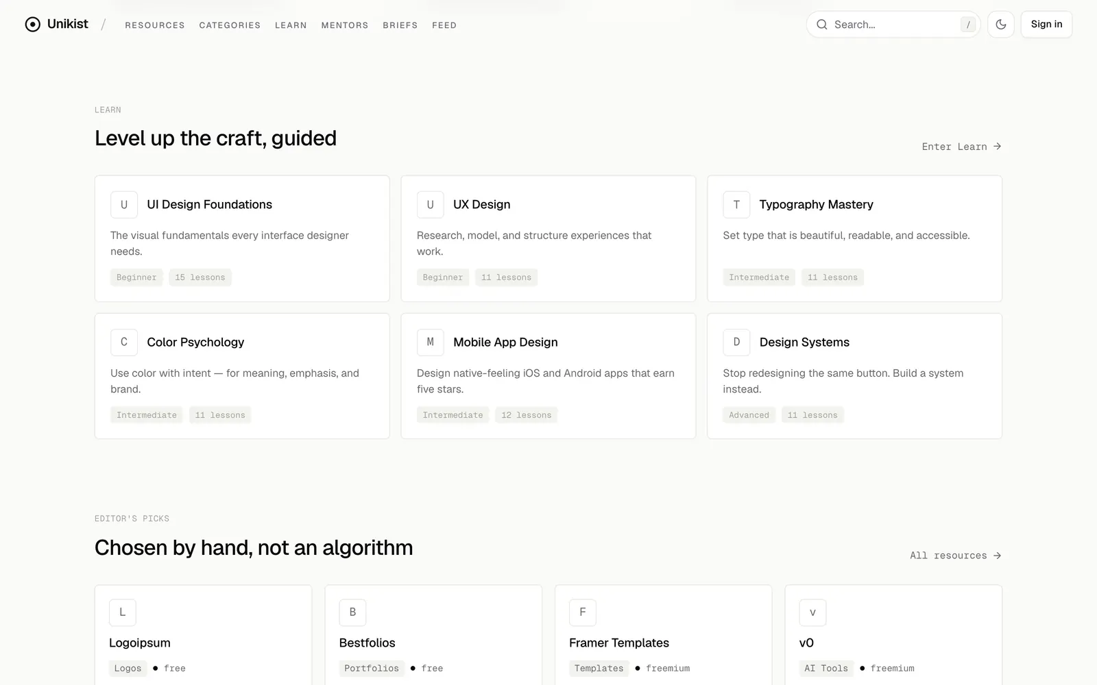
The visual system
On the home page, the index has no colour of its own.
- Graphite#0A0A0B
- Ink#121212
- Silver#9A9AA0
- Hairline#E8E8E4
- Paper#FBFBF9
Typeface
Geist + Geist Mono
Geist for everything you read; Geist Mono for facts — counts, chips, labels.
- paper
- #FBFBF9
- ink
- #121212
- dark
- #0A0A0B
- hairline
- #E8E8E4
- radius
- 0.75rem
- ease
- cubic-bezier(.22, 1, .36, 1)
Monochrome up front
On the home page an entry is a letter in a tile. In the directory, favicons and two price badges bring the colour back.
Black hero, either theme
Light is the default and there is a dark theme, but the search always sits on black.
One easing
Everything uses the same curve. Results stagger by 45ms; the theme changes with a 480ms circular wipe.
Still when asked
With reduced motion on, the hero is a plain gradient and the theme switches at once.
The build
Built with
- Next.js 15App Router
- React 19interface
- Tailwindstyling
- Supabaseaccounts and data
- cmdkthe ⌘K palette
- react-three-fiberthe light in the hero
A Next.js app with a database behind it, and a search that never leaves the browser.
A code, not a password
Sign-in is a code sent by email. Voting needs no account at all.
The index is small on purpose
The whole directory can be scored in the browser, which is what makes search feel instant.
Borrowed light
The beams behind the search field are the open-source Beams component from React Bits, not something I wrote.
The result
Live: 696 resources in 18 categories.
The directory is the finished part. The community side — feed, collections, learning paths — is built and still quiet.
unikist.comWhat I learned
I kept adding shelves when the problem was the front door.
Community, learning, briefs, a gallery home: each one made the site bigger and the first screen weaker. The version that worked took the home page away and left a text field.