diddy.cam
A link-in-bio page that can actually look like you: one profile, twenty-seven themes, and a chaos button.
- Role
- Design, front-end
- Type
- Personal project · Web app
- Status
- Live and free · diddy.cam
- Year
- 2026
The itch
Every one of these tools makes the same page.
My read of the category. Not research.
Same shape
Avatar, name, buttons. The only thing you get to choose is the colour.
Sign up to look
You hand over an email before you find out whether you like it.
Taste behind a plan
The good background is three sections down, on the paid tier.
Rules I set
- 01
Publish is the only locked door
Claim a handle, pick a face, add links, roll the dice — all as a guest. You sign up at the very last step, and the page publishes exactly as you built it.
- Why
- People should find out whether they like it before they are asked for an email.
- 02
A theme is someone’s content
A profile’s look belongs to its owner. The site’s own pink and yellow never touch a profile.
- Why
- The moment the product’s style leaks into someone’s page, it is the product’s page.
- 03
The preview is the real thing
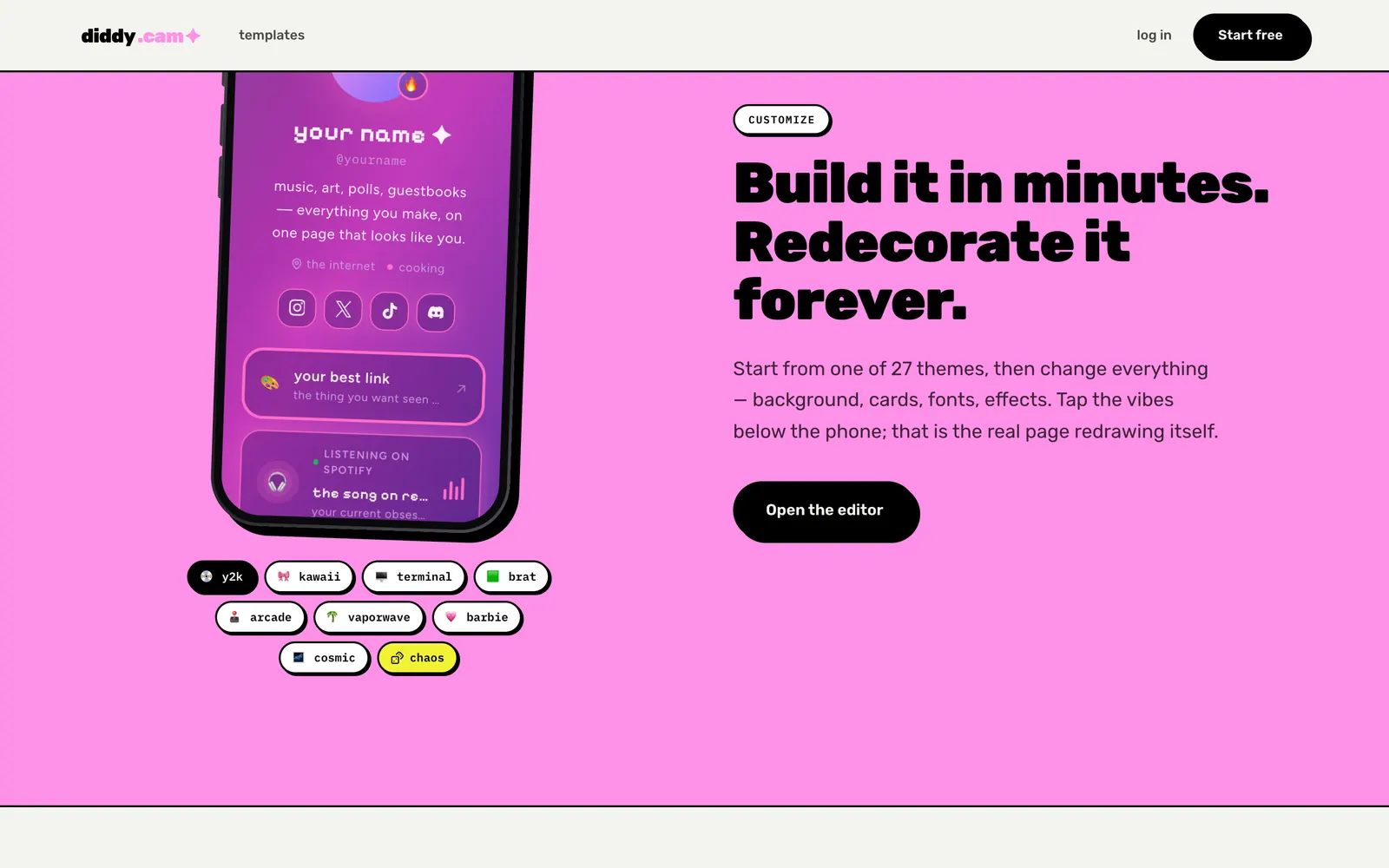
The phone on the landing page and in the editor runs the same renderer as the public page. It is not a picture of one.
- Why
- A preview that is drawn separately will eventually lie.
- Effect
- Half-width widgets size themselves from their container, so the phone shows what a phone shows.
- 04
Chaos is curated
The dice pick from ten palettes and set the text colour from how bright the background is.
- Why
- Random should land somewhere interesting, not somewhere illegible.
- 05
No invented numbers
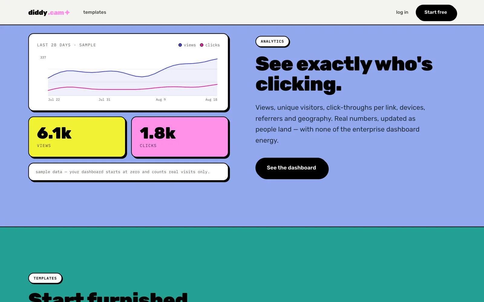
Seed profiles, testimonials and a map of countries were all deleted. The chart on the landing page is labelled as sample data; a real dashboard starts at zero.
- Why
- A page about identity cannot open with made-up people.
The look
Black outline, hard shadow, flat colour. It is meant to look like the internet, not like software.
- Paper#F4F4F0
- Black#000000
- Pink#FF90E8
- Yellow#F1F333
- Periwinkle#90A8ED
- Teal#23A094
Typeface
Rubik + IBM Plex Mono
Rubik up to weight 900 for anything loud, IBM Plex Mono for labels and pills. That is the site. Profiles choose from eight other faces.
- border
- 2px solid #000
- shadow
- 4px 4px 0 #000
- hover
- translate(-2px, -2px)
- press
- translate(2px, 2px)
- time
- .18s
- ease
- cubic-bezier(.2, .9, .3, 1.3)
Slab
A 2px black border and a 4px shadow with no blur. That is the whole component language.
Press
Hover lifts it up and to the left and the shadow grows. Press and it sinks into the page. 180ms, with overshoot.
Lowercase, self-aware
“will it look cursed on a phone”. “an empty page is a bold artistic choice”. The copy is part of the system.
Stickers and tickers
Preset cards sit tilted like stickers; black marquee strips run between sections.
The fun parts
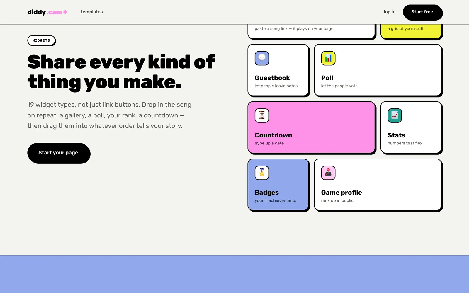
Links move by the grip. Put them in your order.
- now playing
- gallery
- guestbook
- poll
- countdown
Links move by the grip. Put them in your order.
- 01
Tap a vibe
Eight chips under the phone, plus chaos. The page inside redraws in that theme.
- 02
Steal this fit
Two taps copy another page’s look, and the credit travels with it.
- 03
Find the eggs
Seven fast taps on an avatar. A secret word. Up, up, down, down.
- 04
Enter
Browsers block sound until you touch something, so the intro screen is also what lets the music play.
The build
Built with
- Nuxt 4on Vue 3
- Tailwind v4site styling
- Piniaeditor state
- Clerkaccounts
- SQLiteprofiles and counters
- satorishare cards
One renderer, driven entirely by CSS variables.
A look is an object
An appearance becomes a set of variables on the profile’s root. Every widget styles itself from those and nothing else.
Counting without watching
Analytics are totals, keyed by a salted hash that changes daily. No addresses are kept.
The landing page ran hot
222 endless animations on one page warmed phones up. The miniatures now render still, and it is down to 37.
Moved house once
It was built in Next first and then ported to Nuxt.
The result
Live, and actually free: 27 themes, 19 widgets, unlimited links.
There is no premium tier. Every counter on every page starts at zero and only counts real visits.
diddy.camWhat bit me
The first analytics only ever counted me.
They were written to the visitor’s own browser, so every owner saw their own visits and nothing else. It looked fine from where I was sitting.
Then the same lesson again: every profile briefly shared one hard-coded id, so separate pages shared reactions. If a piece of state has an owner, name the owner first.