EdgyCore
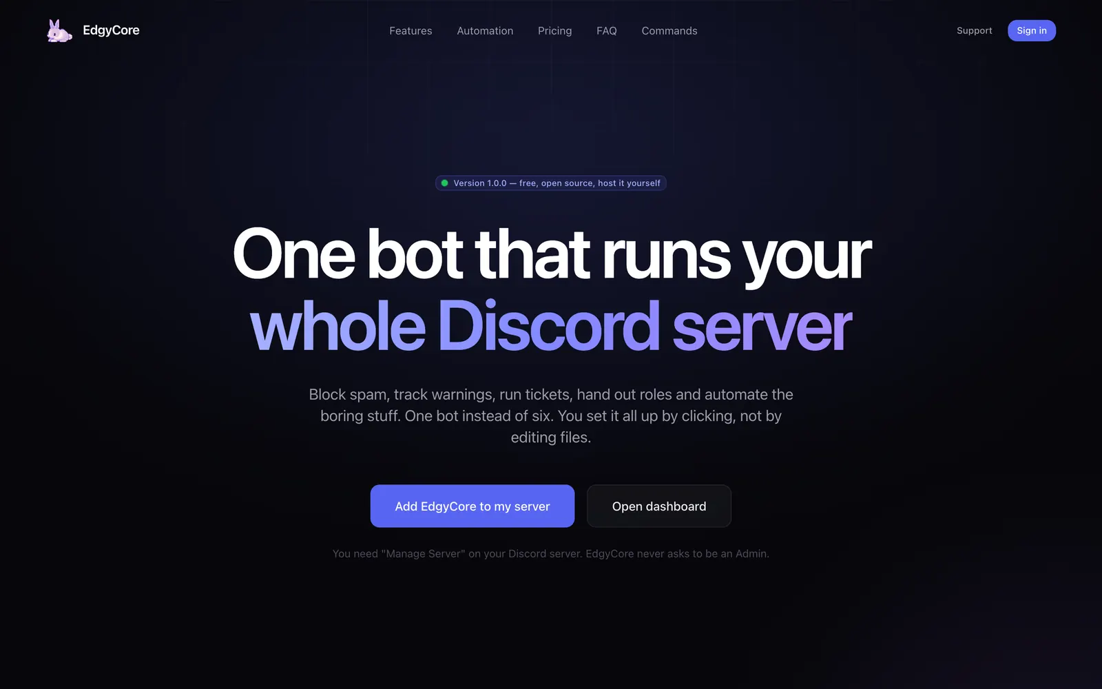
One Discord bot and one dashboard that do the work of six: moderation, automations, tickets, roles and logs — set up by clicking, not by editing files.
- Role
- Product design, UI, build
- Type
- Personal project · Bot and dashboard
- Status
- Live, v1.0.0 · edgycore.site
- Year
- 2026
The problem
Moderation tools get read in the middle of something going wrong.
A working assumption about moderators, not a research finding.
So the interface is dark, dense and written in short sentences. Nothing on it moves unless you made it move.
Rules bite on day one
A new filter is live the moment it is saved. There is usually no way to see what it would catch first.
Nobody agrees what happened
Without a numbered record, a ban is one moderator’s memory.
Feature counts lie
“500+ features” is how every bot listing reads. It tells you nothing.
Decisions
- 01
Test before it bites
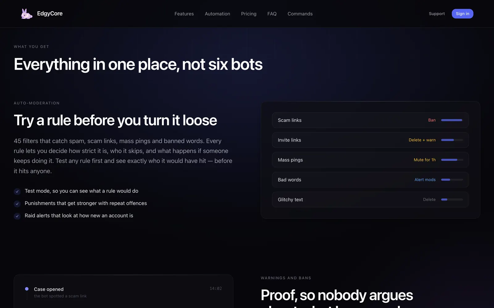
Any automod rule can run in test mode: it logs what it would have matched, marked as simulated, and does nothing. A rule tester dry-runs any message you paste in.
- Why
- A moderator should be able to be wrong in private.
- Effect
- Nothing is recorded, no strikes build up, and nobody is punished.
- 02
Sentences, not schemas
An automation is “what starts it, any checks, what happens”. A finished step folds down into a sentence: give Verified.
- Why
- The person building it is a moderator, not a developer. The builder should read like the rule.
- 03
Greyed, not hidden
Actions that cannot follow the chosen trigger stay in the list, greyed, with the reason beside them.
- Why
- Hiding them reads as “the dashboard is missing things”.
- 04
Every number is counted
62 starting events, 43 checks, 49 actions, 45 spam filters. Each figure on the site is counted from the code.
- Why
- An inflated feature count is the fastest way to look like every other bot listing.
- 05
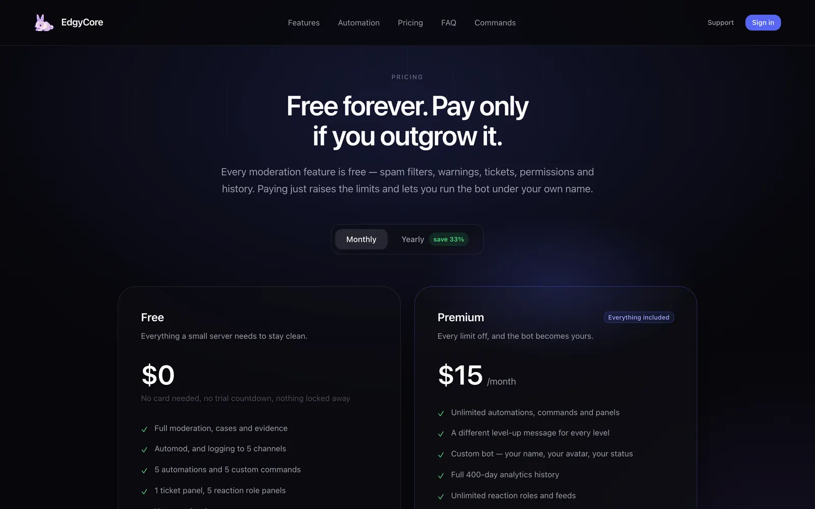
Pricing cannot drift
The pricing page is drawn from the same catalogue the server enforces.
- Why
- What the page promises and what the server charges should be one object.
- 06
One path for every punishment
Bans, mutes, warns and notes go through one function, in one order: check, collect evidence, tell the member, act, write the case.
- Why
- If there is one path, there is one record.
The visual language
Dark, indigo and still. Glow is allowed; movement mostly is not.
- Page#07070B
- Indigo#5865F2
- Violet#8B5CF6
- Ban#F87171
- Mute#FBBF24
- Warn#60A5FA
- Ink#E8E8EE
Typeface
Inter
Declared as Inter with a system fallback. Display type is weight 600 at −0.035em; eyebrows are 11px capitals.
- page
- #07070B
- ink
- #E8E8EE
- brand
- #5865F2
- display
- clamp(2.75rem, 6.4vw, 6.5rem)
- measure
- 1400px
- reveal
- 16px · 0.55s
Scale
The first landing page was correct and far too small: a 900px hero on a 1440px display reads as a form. Display type now runs up to 6.5rem.
Rows, not a card grid
Features are alternating two-column rows on a 1400px measure, each with a mock of the real screen.
Colour is status
Indigo is the brand. Red, amber and blue are ban, mute and warn — on the site and in the product.
Entrance only
Things rise 16px as they arrive and then hold still. Nothing loops while you read.
Interaction
Flip the switch. In test mode a rule only shows what it would have hit.
Ruleword filter + raid protection → delete, warn
- anyone up for a game later?
- FREE NITRO click here → bit.ly/…would be removed
- the new channel layout is so much better
- join my server join my server join my serverwould be removed
Sample messages. In test mode a rule only shows what it would have hit.
- 01
Warnings escalate
Strikes inside a window lead to stronger punishments, and the ladder does not step back down by itself.
- 02
Variables you can see
Type a variable into a message and a live preview shows it filled in by the real engine.
- 03
Tickets in one place
A panel is a message with buttons. Each button opens to show everything it does — form, roles, priority.
- 04
An audit trail in sentences
Who, what, and what changed — with ids turned back into names.
The build
Built with
- TypeScripta pnpm monorepo
- discord.jsthe bot, sharded
- Fastify 5the API
- Prisma + PostgreSQL52 tables
- Redis + BullMQmessaging and jobs
- Nuxt 4 + Tailwindsite and dashboard
Four services and a database, arranged so the dashboard never holds a Discord token.
The API never talks to Discord
It asks the bot over Redis. Live updates travel bot, Redis, API, WebSocket.
One app, two faces
The marketing site and the dashboard are the same Nuxt app, sharing the same panels, buttons and badges.
“Received”, not “active”
After paying, the page says the payment was received. The plan turns on only when the payment provider confirms it to the server.
Runs on your own machine
Docker Compose starts everything with one command.
The result
Live at v1.0.0. Free forever, with a paid tier for servers that outgrow it.
Every moderation feature is in the free plan. Premium raises the limits and lets the bot run under your own name. It can also be hosted yourself.
edgycore.siteWhat I learned
Correct and too small is still wrong.
The first landing page had the right words in the right order and looked like a sign-up form. The fix was scale, not content.
In the product it went the other way: ticket panels and ticket buttons were two tidy resources that were really one thing, and merging them removed a whole tab.