Parla
A language-learning app where the sentence explains itself: every word sits above its meaning and the job it is doing.
- Role
- Product design, UI, build
- Type
- Personal project · Web app
- Status
- Demonstration build · language-eight-alpha.vercel.app
- Year
- 2026
Try it
Fill the gap. Two of the three answers are wrong in a useful way.
Ayer ____ al mercado.
yesterday I ____ to the market
Fill the gap. Three guesses, no penalty.
- 01
Teach, then drill
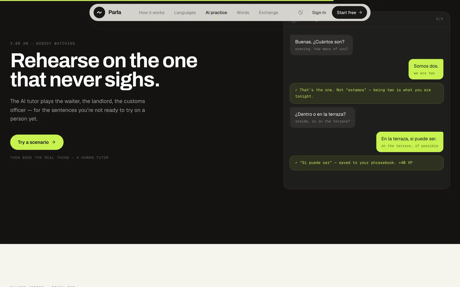
A lesson sets a situation, teaches each phrase before testing it, and ends in the conversation it was for.
- 02
Recognise, then produce
Nine kinds of exercise, from picking a picture to saying it aloud. Recognition always comes first.
- 03
Help that fades
At the start there is inline translation, word tiles and three hints. By C1 there are no translations and the prompts are in the language.
- 04
Review
A new card comes back tomorrow, then in three days, then longer. Miss it and it is back in ten minutes.
The problem
A translation tells you what a sentence means. It does not tell you why.
A design hypothesis. No educational research is cited, because none was done.
Words arrive without jobs
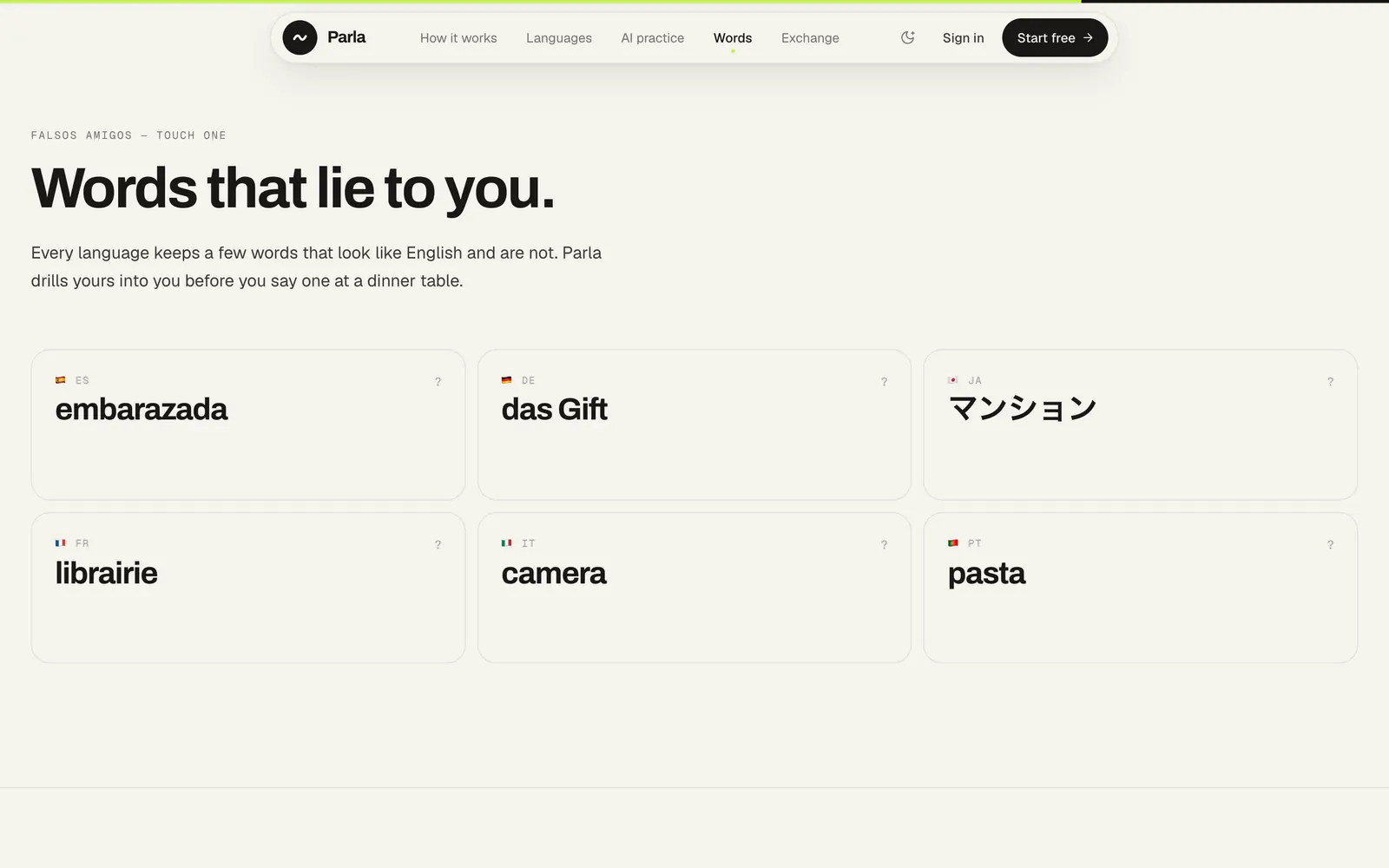
A vocabulary list gives you “fui = went” and stops there.
Content with no thread
My first generator put “good morning” next to “one coffee please”. Correct, and unconnected.
One order for every language
I built a single curriculum for all eleven. That turned out to be a false premise.
The approach
Most of the work was taking things away.
The interlinear
It took two rounds to get right. It now opens and closes the landing page.
One language at a time
A half-Spanish sidebar and a mixed dashboard were unreadable for a beginner. The app is now scoped to the language you are learning; the chrome stays in English.
Authored, not generated
The model no longer chooses what to teach. Units are written; it only fills a slot that has already been decided.
A curriculum per language
Japanese starts with speech, with hiragana alongside. Spanish does not need to.
Twelve themes to five
Full themes were behind nearly every layout bug. Five colour-only ones stayed.
Three blocks
The dashboard was doing too much. Home is now three blocks, and anything with its own page gets one line.
Design decisions
- 01
The sentence is the signature
Each word sits on a hairline above its meaning and its grammatical job, and a highlight walks through them.
- Why
- It is the one thing the product does that a flashcard cannot.
- 02
Play before you sign up
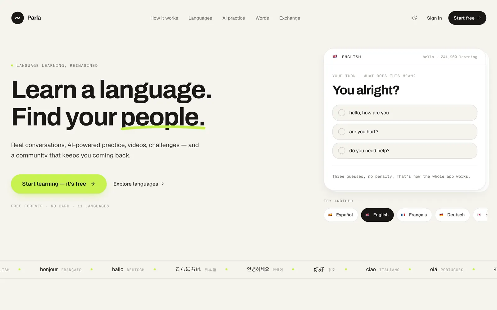
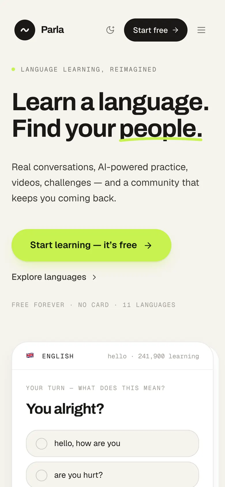
The card in the hero is a real exercise. Solve it and the sentence pulls apart, word by word.
- Why
- The idea should be felt in the first ten seconds, not described.
- 03
Lime means yours
Lime is your progress, or the thing to press. Ink is not started; moss is done. Lime is always a fill and never text — on paper its contrast is 1.23 to 1.
- Why
- If colour is going to mean something, it can only mean one thing.
- 04
Gates, not click-through
A level opens at 80% on its check; a unit challenge needs 70%. Typing the address of a later lesson does not let you in.
- Why
- Progress that cannot be failed does not tell you anything.
- 05
A test, not a question
Placement is short blocks of six. 80% moves you up, 40% moves you down, four rounds at most, and a tie goes to the lower level.
- Why
- Asking “are you a beginner or intermediate?” places nobody.
- 06
A mascot that is never disappointed
Tilde is a diacritic: the smallest mark that changes what a word means. It sits above each question and has no sad state.
- Why
- I borrowed the mechanics of streak apps and left the guilt behind.
The system
Warm paper, near-black ink, and one lime that is only allowed to mean two things.
- Paper#FAF9F7
- Canvas#F5F3ED
- Lime#C6F24E
- Moss#208E60
- Ink#191817
Typeface
Archivo + Geist
Archivo at 700 for headlines, Geist for reading, Geist Mono in capitals for labels.
- paper
- #FAF9F7
- ink
- #191817
- accent
- #C6F24E
- moss
- #208E60
- ease
- cubic-bezier(.22, 1, .36, 1)
- wrong answer
- 140ms wiggle
Colour is state
Lime: yours, or press this. Moss: done. Ink: not yet.
Hairlines
One-pixel borders, and radii from 3 to 28. Nothing carries a heavy shadow.
A wrong answer wiggles
For 140ms. No red flash and no buzzer.
One language on screen
Everything you see belongs to the language you chose. The navigation stays in English so a beginner can still find their way.
The build
Built with
- Nuxt 3on Vue 3
- Tailwindstyling
- Piniaprogress and review
- TypeScriptcurriculum and engine
- OpenAI SDKlessons and tutor, provider swappable
- Vitest13 test files
The curriculum is written by hand. The model only fills in a slot that has already been decided.
Checked before it is shown
A generated lesson is checked for shape, language, difficulty, duplicates and consistency. That exists because a cached lesson once shipped three identical answers.
Cached
A lesson that took 29.5 seconds to generate opens in 0.002 once it has been cached.
Any provider
OpenAI or DeepSeek, chosen by one environment variable. Keys never reach the browser.
A mascot with no WebGL
Tilde is rendered to still images — 18 states, 520KB in all — and animated with CSS.
The result
A demonstration build: the product is real, the people in it are not.
Eleven languages and eight stages from A0 up; the three I have counted hold about 120 units each. Sign-in is simulated, and the learners, rooms and figures on the landing page are placeholder data — so none of them are quoted here.
language-eight-alpha.vercel.appWhat I learned
My first version was designed for a portfolio, not for the people it was for.
It was quiet, minimal and a little academic — the register I reach for by default, and the wrong one for someone of fifteen. The mascot, the lime and the tone all came from correcting that.
The other lesson was about AI. Letting a model decide what to teach produced correct sentences with no thread between them. It is good at filling a slot. It should not be choosing the slot.